Case Study - Medication Scheduler

July 2022 · Research, Personas, User Stories, Wireframing, Prototyping, Interviews, Usability study

Project Introduction

My third and last case study done as part of the Google UX Design program. This project was completed under the banner of "design a uxer expierience for social good". The goal was to design an app, accompanied by a responsive website that helps people create and maintain medication schedules and to receive alerts and notifications.

My role

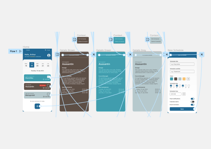
For this case study I was working on my own with no team around. Based on a project prompt, I conducted user interviews, layed out a structure and a flow for the website, created low and high-fidelity prototypes and tested these in a usability study to polish the final designs.

Screenshot of Website

Who am I designing for?

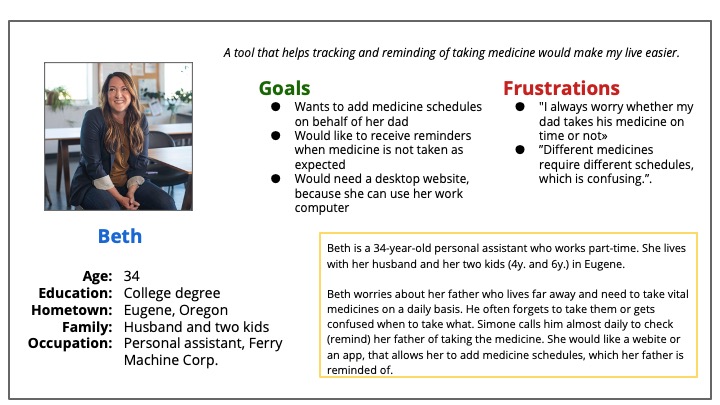
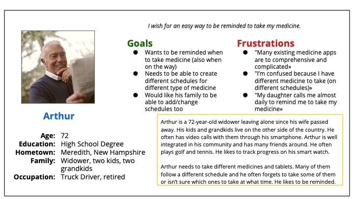
At first it seemed obvious that my target group would primarily consist of users who receive medication because they have undergone medical examinations or due to long-term illness. I was instantly thinking of elderly people. Good that I've conducted interviews and created an empathy map to understand the users better. Only because of it, I've learned that a second target group are friends and relatives of individuals who are on medication. These users tend to worry and have a need to receive alerts when their loved ones forget to take the drugs on time.
Persona 1
Persona 2

Ideation process

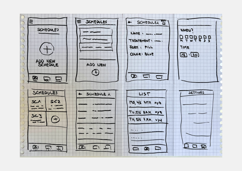
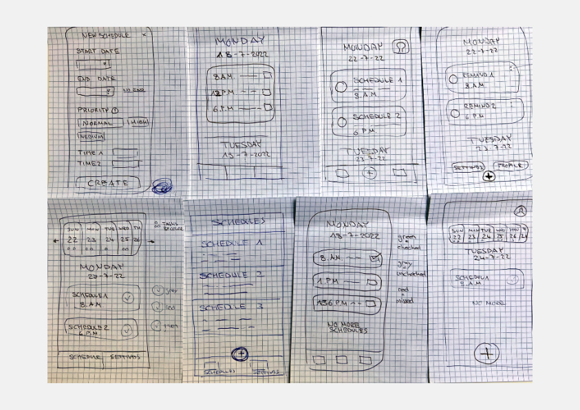
While brainstorming solutions I started creating sketches for how and when users will interact with the product. Putting myself in the users position has created a clear picture of the structure and flow that was required for the site. I did a few crazy eight sessions to brainstorm and gather ideas. I was mainly focusing on a minimalistic design and simple navigation.

Crazy Eight 1
Crazy Eight 2

Usability observations

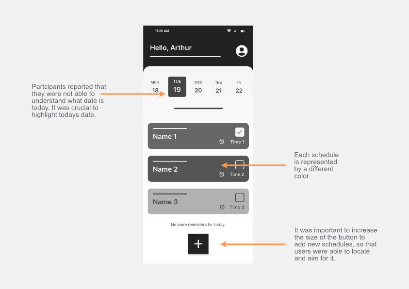
From the sketches I went on to design wireframes and put them together in a low-fi prototype. As I wanted to get user feedback before polishing my designs, I've run a usability study with handful of users from both of my target groups. The study has helped me guide the designs from wireframes to mockups.

Based on my observation, I gained a valueable insight to make the design and the functionality more user-friendly. I have improved typography and iconography to make an even more seamless user flow.

Usability Study - Improvements
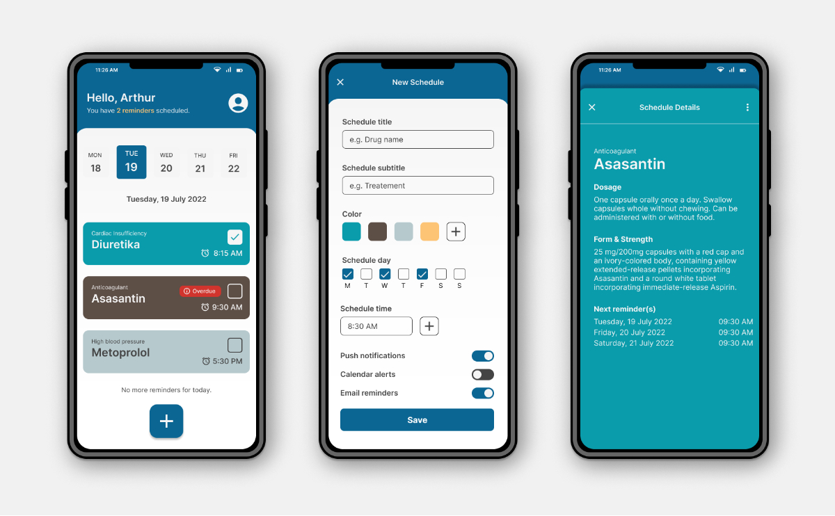
Final Prototype

Conclusion and final thoughts

Don’t be afraid to make mistakes. That's a lesson I've learned with this project. Especially at the beginning when I struggled to get positive feedback from my peers and users. But I kept going and even though there were more hurdles to overcome, it was ok to go into the wrong direction, because it has helped me get better. I wanted to tell a story and make the users feel positive while using the product. I felt like it was really helpful that I iterated on my designs after each feedback that I've received.

Daniel Koch UX Designer

Email hello@kochdani.ch

Location Zurich, Switzerland

Social